Brand Identity
Visual Direction & Systems
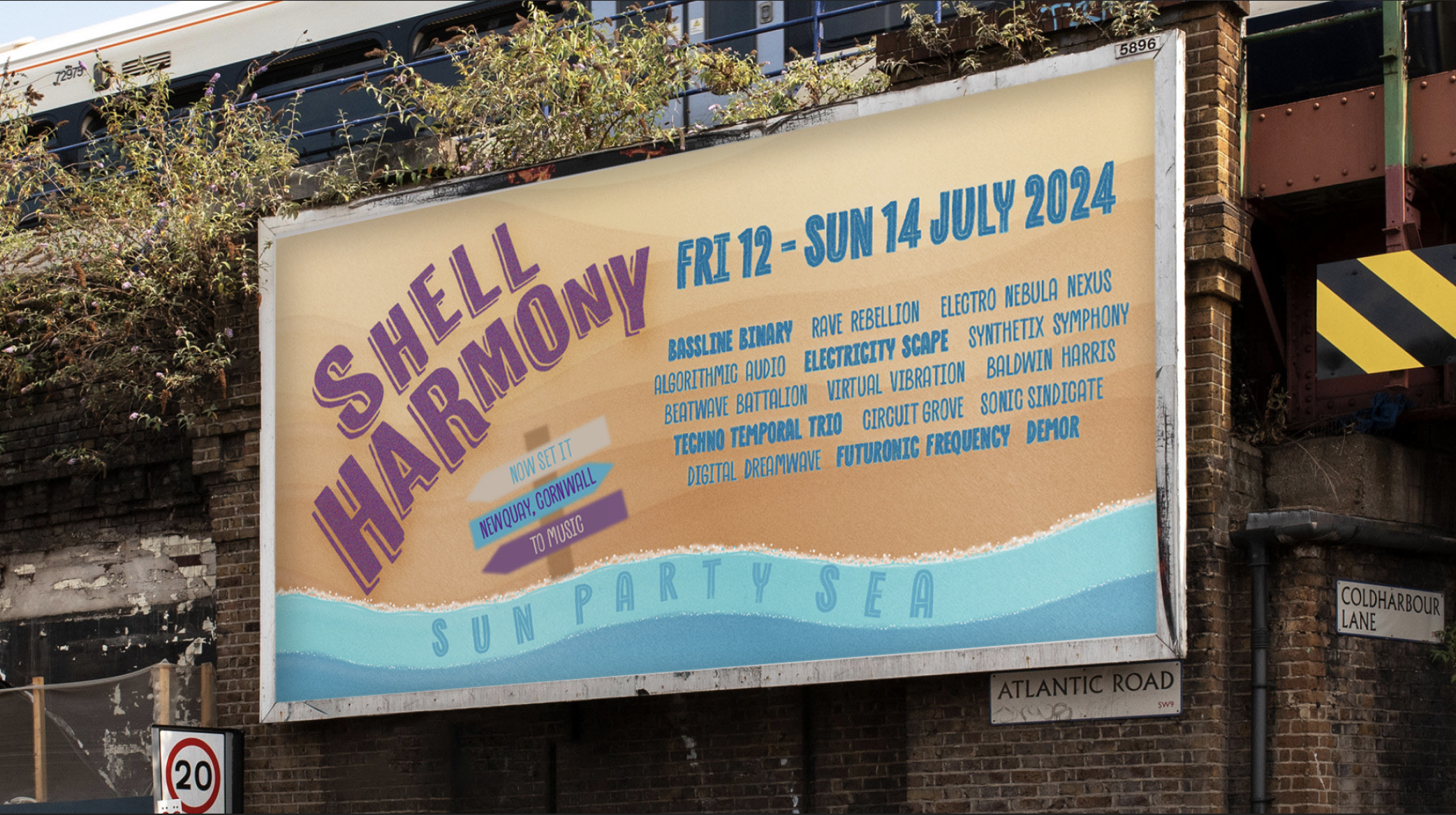
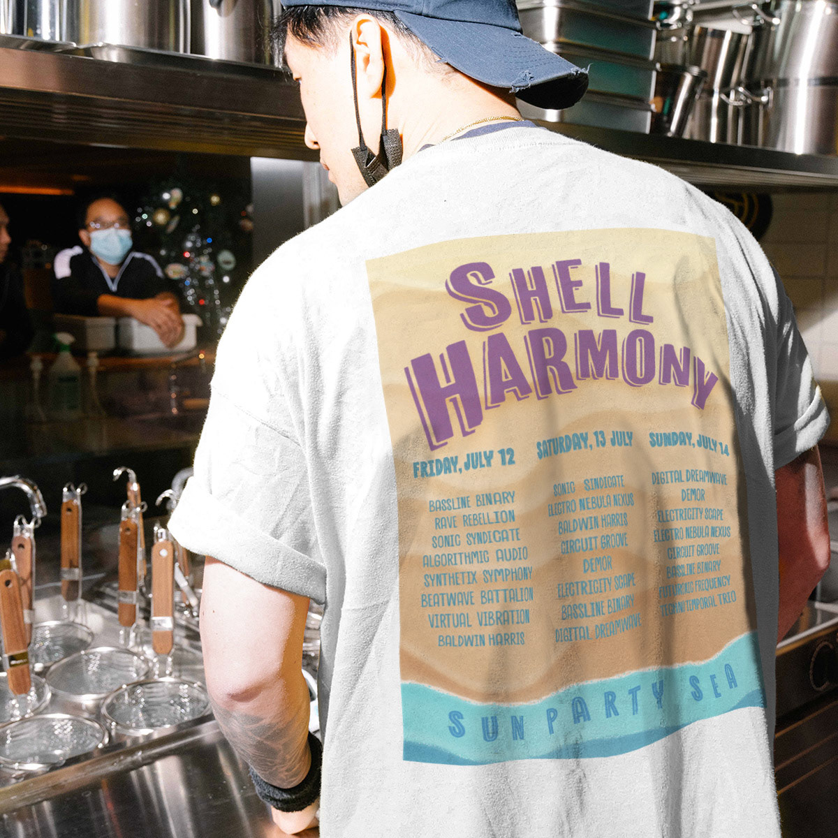
MUSIC FESTIVAL SHELL HARMONY
Design Process
I was responsible for multiple design components that supported the festival's branding and user
experience. I designed a bold and eye catching billboard that captures the energy of the festival through
strong typography and a beach inspired color palette. I also created a custom festival T shirt featuring
the event lineup, ensuring visual consistency across both print and merchandise.
In addition, I designed a mobile friendly ticket booking app interface focused on usability and engagement. The layout was kept clean and intuitive to allow users to browse and purchase tickets with ease.
Visual Identity and Concept
The visual identity draws inspiration from the festival's coastal setting, using wave motifs and warm
tones to reflect a beach atmosphere. A retro rave inspired typographic style was selected to convey the
vibrant energy of techno music. The ticket booking interface follows a user centered design approach,
prioritizing clarity and simplicity for a seamless booking experience.
Reflection and Learnings
This project strengthened my skills in branding, visual storytelling, and user interface design. It allowed
me to experiment with typography, layout, and color psychology to create a cohesive and immersive festival
experience. If expanded further, I would explore additional merchandise concepts and interactive marketing
elements to enhance audience engagement.

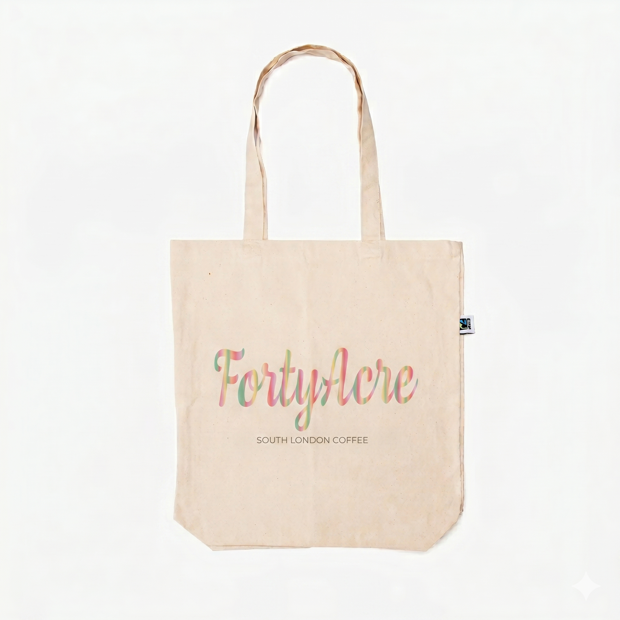
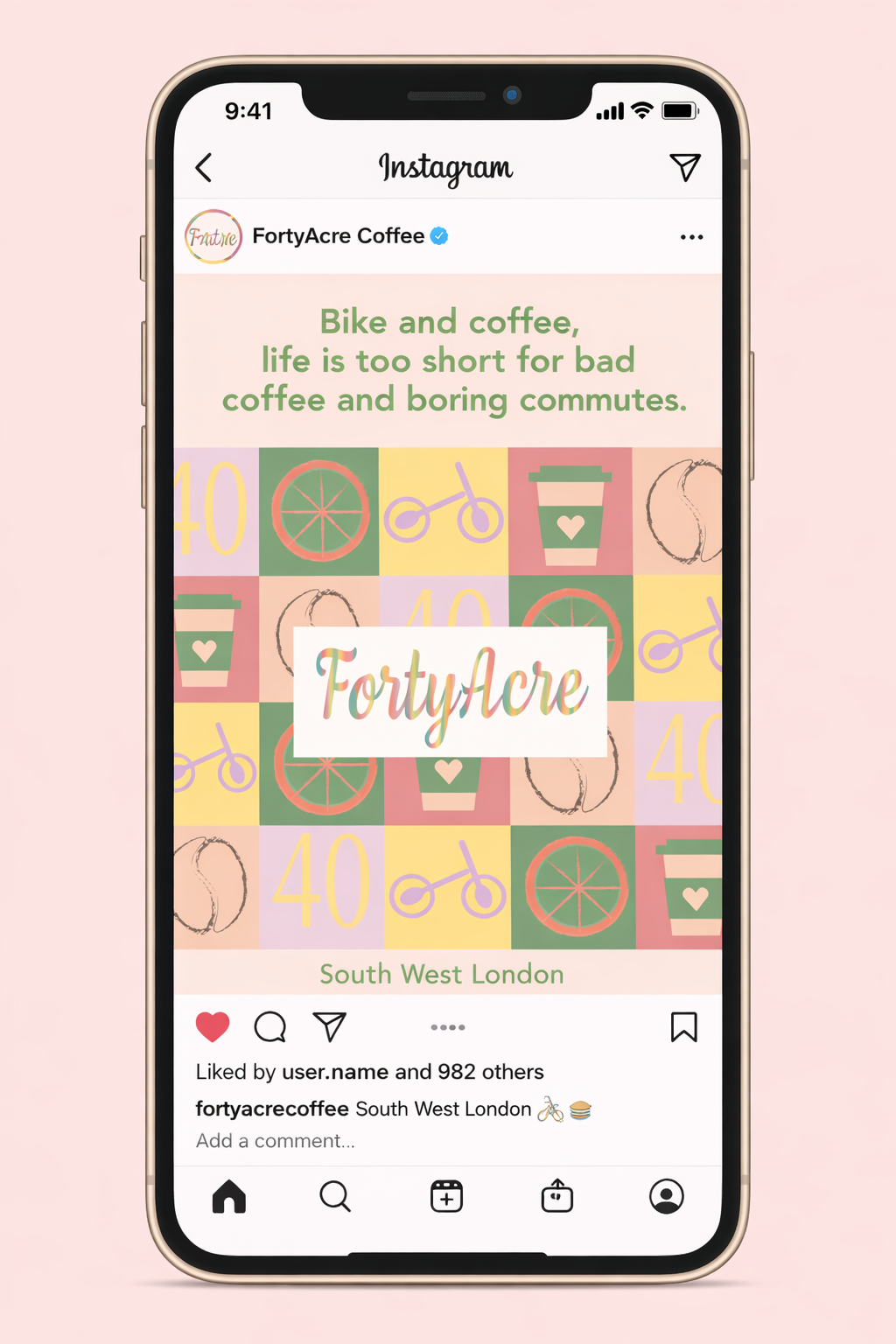
FORTY ACRE

My Role and Contributions
I was responsible for designing the brand identity, including the logo, typography, and color palette to
clearly communicate the brand's values. I also created a range of print and digital assets, such as
magazine covers, promotional materials, and social media visuals. In addition, I developed the overall
visual concept by integrating elements that represent coffee culture, cycling, and sustainability.
Visual Identity and Concept
The color palette features warm, earthy tones combined with soft pastel accents to create a friendly and
approachable aesthetic. The typography blends modern and handwritten styles, striking a balance between
professionalism and creativity. Graphic elements such as bicycles, coffee cups, and patterned motifs
reinforce the brand's focus on sustainability and community driven experiences.